New Sitelink Look

Comments
-
I'm not super impressed. The fonts is very light and for me a little smaller then I would like, the background around the operations is very dark. The note section on the front part of a tenant's account no longer has Red Font which doesn't draw my eye to that note anymore. The photo ID section, has shrank all the ID's making them difficult to read unless you click on them. I haven't even explored the whole think yet, so I may come back to add things that I find. I agree it still looks dated.pammerjammer1964 said:Does anyone like the new look of Sitelink? I think it looks and feel like the old Beta ran computers back in the early 90s.8 -
 MamaDuke7 Registered User, Daily Operations Certified, Advanced Operations Certified, Administrator Certified, myHub Certified ✭✭✭✭✭It's horrible. And why put time and energy into this instead of important things like chip readers, etc??? This is a big step backward. Makes me thankful to be transitioning to a different software next month.10
 -
I agree with all comments. I came here to say I hate the font, it's too small and not bold like the last one. I can't differentiate between my L016, L015, L013 stores.
And I haven't had a chance to look at the Red Tenant note on front yet. Oh geez! Why do programmers always have to update and not do anything valuable. You don't need to change just for the sake of change for goodness sake.
You can always tell when they don't work daily with their own program.
Put it back until you can come up with something better.11 -
Not a fan of this new look at all! THUMBS DOWN - it's terrible!! Font is too light and small! Very BLAH!!11
-
VERY hard to read. Every section seems to have a different font, and all of the icons are cut off or missing. Do they not test these updates at all? No one looked at it and said "This doesn't look very consistent"? The ID in the front of the tenant account is so incredibly glitched out.10
-
This newest look reminds me of the movie Elf.
When it's discovered that naughty-lister dad Walter Hobbs has signed off on blank book pages, sending them straight to the printers as-is.
It's giving "photo inserted in the middle of Word document text"-type strangeness, and the powers that be still saying, "Eh, good enough."
Need I even mention the strangely disproportional font sizes? The cut-off icons? The strange blank spaces? The ID display on every account?? 14
14 -
I strongly dislike this “New Look.” It’s extremely difficult to read, and trying to work with it is honestly straining my eyes. The overall experience feels uncomfortable and distracting.
If this is part of a beta phase throwback era look (which is what it feels like), I would urge you to reconsider the direction. The previous design worked perfectly well and didn’t need such a drastic overhaul. Small updates—like minor color adjustments—would be understandable, but changing everything at once has made the interface much harder to use.
Please consider returning to the previous version or offering users the option to switch back.
11 -
MamaDuke7 Registered User, Daily Operations Certified, Advanced Operations Certified, Administrator Certified, myHub Certified ✭✭✭✭✭This feels like when you start your computer in Safe Mode and everything is a basic version of its true self.7
-
What's up with the ID on Acct? Doesn't even fill the space.
 9
9 -
I HATE the new look! Besides the font being too little for people with vision disabilities, it's small for people without!!! The ID no longer takes up the whole ID spot and you have to click it to see the whole thing, which is a waste of productivity! I don't care about the light and dark, but they have GOT to do something with the size of the fonts and the ID's. I haven't even begun to see what the forms look like yet! I'm scared too!9
-
I'm not a fan. I'd sure like them to ad features that will help us. We need the option to upload photos to the notes section. We also need the ability to change font colors. And did anyone else have the photos of the customers shrink up?8
-
Soooo glad we ditched Sitelink 18 months ago. This just confirms we made the right choice. I didn't think they could actually make Sitelink this much worse than it already was.
I can't believe instead of adding new features and fixing broken things that this is what they choose to spend their time/money updating.8 -
 GradyB Registered User, Daily Operations Certified, Advanced Operations Certified, Administrator Certified, myHub Certified ✭✭I do NOT like the new look at all.
The old interface looked soft and sleek. Easy to read and differentiate between lines, font was cleaner and easier to read.
The new look takes me back to the 90's with cheap windows 3.1 icons and typewriter looking font.
Did someone get fired and before they left they played a massively horrible joke on the company?
Please revert it back to the way it was!!!!!2 -
The new UI is really hard to use and I don't like it.
The last UI was easy to move around in because of the colors and symbols, I could easily jump around to where I needed to go, this new version feels like looking at a wall of text and my brain glosses over when it tries to read it.
Please bring back the old version, it was far superior, or at least make it an option to switch between the two and not just force people to use the black and white one. The new UI feels like an attempt to "modernize" it, and like so many other companies trying to do that it just comes across as soulless.4 -
MamaDuke7 Registered User, Daily Operations Certified, Advanced Operations Certified, Administrator Certified, myHub Certified ✭✭✭✭✭@storable_support I think these comments should be forwarded to the development team.4
-
 themage Registered User, Daily Operations Certified, Advanced Operations Certified, Administrator Certified, myHub Certified ✭✭✭✭✭Perhaps my facility is just lucky, but I don't see any visible changes to Sitelink after the last updates.
I wonder if the "new look" wasn't accidental and they stopped it part way through the deployment of the new updates, or if they are rolling it out in waves.
Have any of you with the new look tried updating Sitelink again manually to see if it changes back?
1 -
MamaDuke7 Registered User, Daily Operations Certified, Advanced Operations Certified, Administrator Certified, myHub Certified ✭✭✭✭✭
This was just from yesterday's update. If you haven't updated this week, you won't see it yet.themage said:Perhaps my facility is just lucky, but I don't see any visible changes to Sitelink after the last updates.
I wonder if the "new look" wasn't accidental and they stopped it part way through the deployment of the new updates, or if they are rolling it out in waves.
Have any of you with the new look tried updating Sitelink again manually to see if it changes back?2 -
Be sure to fill out a survey in Sitelink to let them know about your thoughts on the new look. Click Help ---> Give Feedback ----> Complete the Survey and submit. Hopefully someone will take note of our thoughts on the new software and reconsider!4
-
Hi everyone,
Thank you so much for the honest feedback on the new look. We’re following this thread closely and hear you.
Right now, our product and design teams are assessing the feedback from this early access group to determine the best path forward.
Please keep the feedback coming—we are listening! Thanks for your patience as we work to get this right.5 -
@storable_support, please fix the printer issue and roll back the GUI update!!! I can no longer print on any other printer, except the default printer, and I'm getting error messages when I print invoices! Ughhhhhhhhhhh! This is not what we pay $$$ a month for!2
-
@brandim156
I'd love to help you with your printer issues. Can you send me your name, location, and contact information so I can have our tech support team reach out to you? Or if you'd like to reach out directly, you can contact them at sitelinksupport@storable.com or at (855) 718-28841 -
It's awful. Font is too small, screen is too light.
I immediately went to the "Feedback" form to express how horrible it is.
I recommend everybody here to do that as well.2 -
Here's where to provide feedback. I did see a post from Storable that they are following this feed and noting the feedback.FCSS said:Be sure to fill out a survey in Sitelink to let them know about your thoughts on the new look. Click Help ---> Give Feedback ----> Complete the Survey and submit. Hopefully someone will take note of our thoughts on the new software and reconsider!3 -
I agree, well spoken2
-
The new look is AWFUL. ROLL IT BACK1
-
Is anyone else having to reboot their computer just to get Sitelink Web Edition to load now? I never had this issue until the update. I am now having to restart my computer and then re-run the live update in the middle of the day just to get it to load back up for the afternoon. It won't load back up from just simply doing a manual live update.1
-
MamaDuke7 Registered User, Daily Operations Certified, Advanced Operations Certified, Administrator Certified, myHub Certified ✭✭✭✭✭
I'd call support for that. That shouldn't be happening.FCSS said:Is anyone else having to reboot their computer just to get Sitelink Web Edition to load now? I never had this issue until the update. I am now having to restart my computer and then re-run the live update in the middle of the day just to get it to load back up for the afternoon. It won't load back up from just simply doing a manual live update.3 -
which software are you going to?? We won't have your expert advice anymore?? That sucks!!MamaDuke7 said:It's horrible. And why put time and energy into this instead of important things like chip readers, etc??? This is a big step backward. Makes me thankful to be transitioning to a different software next month.1 -
PLEASE ROLL IT BACK ASAP!! I have a 32 inch monitor and I can barely see the font, what's with the DL pictures? What was the purpose of doing this? Why wasn't this tested on a select few before rolling it out to everyone? HORRIBLE!!2
-
THIS is exactly what I thought was happening, I had a few days off and came into this!! Tried everything to fix it, since i was off I was not made aware of upcoming changes, turns out I was also unsubscribed from receiving notifications from SL as well. What a **** show!MamaDuke7 said:This feels like when you start your computer in Safe Mode and everything is a basic version of its true self.1 -
Done! Thank you!KellyR said:
Here's where to provide feedback. I did see a post from Storable that they are following this feed and noting the feedback.FCSS said:Be sure to fill out a survey in Sitelink to let them know about your thoughts on the new look. Click Help ---> Give Feedback ----> Complete the Survey and submit. Hopefully someone will take note of our thoughts on the new software and reconsider!1 -
Done! Thank you!FCSS said:Be sure to fill out a survey in Sitelink to let them know about your thoughts on the new look. Click Help ---> Give Feedback ----> Complete the Survey and submit. Hopefully someone will take note of our thoughts on the new software and reconsider!1 -
MamaDuke7 Registered User, Daily Operations Certified, Advanced Operations Certified, Administrator Certified, myHub Certified ✭✭✭✭✭
We are switching to Cubby. So before long, I probably won't be much help for Sitelink users anymore, sadly.sonyawiprud said:
which software are you going to?? We won't have your expert advice anymore?? That sucks!!MamaDuke7 said:It's horrible. And why put time and energy into this instead of important things like chip readers, etc??? This is a big step backward. Makes me thankful to be transitioning to a different software next month.
This was a choice made above my head and one I'm hesitant to support.2 -
I'm not a fan of the new look either. It looks dated and is more difficult to read the text.2
-
MamaDuke7 said:
I'd call support for that. That shouldn't be happening.FCSS said:Is anyone else having to reboot their computer just to get Sitelink Web Edition to load now? I never had this issue until the update. I am now having to restart my computer and then re-run the live update in the middle of the day just to get it to load back up for the afternoon. It won't load back up from just simply doing a manual live update.From Sitelink:
INVESTIGATING
We're aware of an intermittent issue causing login failures. Some SiteLink customers using Single Sign-On are receiving an "internal server error" message. This issue appears related to our authentication provider, and we're currently working with their support team. In the meantime, retrying your login may be successful. We appreciate your patience, and we'll provide updates as we learn more.0 -
Recent notice from Sitelink involving login errors for some user:INVESTIGATING
We're aware of an intermittent issue causing login failures. Some SiteLink customers using Single Sign-On are receiving an "internal server error" message. This issue appears related to our authentication provider, and we're currently working with their support team. In the meantime, retrying your login may be successful. We appreciate your patience, and we'll provide updates as we learn more.2 -
As evidenced from this thread, change and uncertainty is scary! I thank you for all that you have contributed to helping me all these years, you will be missed!MamaDuke7 said:
We are switching to Cubby. So before long, I probably won't be much help for Sitelink users anymore, sadly.sonyawiprud said:
which software are you going to?? We won't have your expert advice anymore?? That sucks!!MamaDuke7 said:It's horrible. And why put time and energy into this instead of important things like chip readers, etc??? This is a big step backward. Makes me thankful to be transitioning to a different software next month.
This was a choice made above my head and one I'm hesitant to support.1 -
IMO, the new look is horrible. Various fonts, abundance of blank space, HORRIBLE 'color' scheme. I wonder how this 'update' actually passed quality control. Grade: D-
1 -
MamaDuke7 Registered User, Daily Operations Certified, Advanced Operations Certified, Administrator Certified, myHub Certified ✭✭✭✭✭
Thank you so much. I appreciate that!sonyawiprud said:
As evidenced from this thread, change and uncertainty is scary! I thank you for all that you have contributed to helping me all these years, you will be missed!1 -
themage Registered User, Daily Operations Certified, Advanced Operations Certified, Administrator Certified, myHub Certified ✭✭✭✭✭I guess my facility is not part of the test group (thankfully), but I wonder if the background color change option is still there for you guys. It probably wont help much, if at all, but I am curious if anyone has tried it.
Company, Utilities, shift-ctrl-Q (form back color and button back color)1 -
MamaDuke7 Registered User, Daily Operations Certified, Advanced Operations Certified, Administrator Certified, myHub Certified ✭✭✭✭✭
I had that though yesterday. Still works, but doesn't help at all!themage said:I guess my facility is not part of the test group (thankfully), but I wonder if the background color change option is still there for you guys. It probably wont help much, if at all, but I am curious if anyone has tried it.
Company, Utilities, shift-ctrl-Q (form back color and button back color)
1 -
 marketer_kristy Registered User, Daily Operations Certified, Advanced Operations Certified, myHub Certified ✭✭✭Not at all. I actually filled out the feedback survey that is under the "Help" option within Sitelink. It has really messed up some employees workflows because despite everything being in the same general spots in the software, it's made it difficult to locate them- despite the claim on the bulletin board that this new interface is easier to read. It absolutely is not.My biggest gripe with Storable/Sitelink is that instead of fixing things that need to be fixed, they just keep making unnecessary changes or adding clunky features that don't help. This "one click login" nonsense? Absolutely useless and pointless, and the same goes for this interface change.Kristy Olney Marketing and Bookkeeping Manager, Stor-All LLC1
 -
marketer_kristy Registered User, Daily Operations Certified, Advanced Operations Certified, myHub Certified ✭✭✭MamaDuke7 said:It's horrible. And why put time and energy into this instead of important things like chip readers, etc??? This is a big step backward. Makes me thankful to be transitioning to a different software next month.
YES! This is our biggest gripe! We NEED chip readers!Kristy Olney Marketing and Bookkeeping Manager, Stor-All LLC1 -
marketer_kristy Registered User, Daily Operations Certified, Advanced Operations Certified, myHub Certified ✭✭✭themage said:I guess my facility is not part of the test group (thankfully), but I wonder if the background color change option is still there for you guys. It probably wont help much, if at all, but I am curious if anyone has tried it.
Company, Utilities, shift-ctrl-Q (form back color and button back color)
They took the notices off my bulletin board, but you will be forced to update to the new interface at some point but I don't recall how far into the future that is. Whatever you do in the meantime, don't run a live update if you can help it.Kristy Olney Marketing and Bookkeeping Manager, Stor-All LLC1 -
themage Registered User, Daily Operations Certified, Advanced Operations Certified, Administrator Certified, myHub Certified ✭✭✭✭✭Yeah, that's how they run their major changes, like the payment processing and website integration.
I have 4 different computers running 3 different versions of sitelink because I have warned my co-workers not to upgrade until they force it. The computer I use is "up to date" (ran live update well after the "new" look rolled out to you guys) because I like to test any changes before my co-workers run into them.
I wish they would actually list the changes in their monthly updates.1 -
marketer_kristy Registered User, Daily Operations Certified, Advanced Operations Certified, myHub Certified ✭✭✭
Do you mind sharing what yall are moving to? I’ve followed you for over a decade on the ISS forum and here and have a lot of respect for youMamaDuke7 said:It's horrible. And why put time and energy into this instead of important things like chip readers, etc??? This is a big step backward. Makes me thankful to be transitioning to a different software next month.") you’re welcome to message me if you don’t want to share here. Kristy Olney Marketing and Bookkeeping Manager, Stor-All LLC0
you’re welcome to message me if you don’t want to share here. Kristy Olney Marketing and Bookkeeping Manager, Stor-All LLC0 -
marketer_kristy Registered User, Daily Operations Certified, Advanced Operations Certified, myHub Certified ✭✭✭
I don't see any way to change the background color. Is that in Sitelink or Corporate Control?themage said:Yeah, that's how they run their major changes, like the payment processing and website integration.
I have 4 different computers running 3 different versions of sitelink because I have warned my co-workers not to upgrade until they force it. The computer I use is "up to date" (ran live update well after the "new" look rolled out to you guys) because I like to test any changes before my co-workers run into them.
I wish they would actually list the changes in their monthly updates.Kristy Olney Marketing and Bookkeeping Manager, Stor-All LLC0 -
MamaDuke7 Registered User, Daily Operations Certified, Advanced Operations Certified, Administrator Certified, myHub Certified ✭✭✭✭✭
Go to the Utilities screen and Shift-Ctrl-Q and the option will come up. It's a hidden menu item!marketer_kristy said:
I don't see any way to change the background color. Is that in Sitelink or Corporate Control?themage said:Yeah, that's how they run their major changes, like the payment processing and website integration.
I have 4 different computers running 3 different versions of sitelink because I have warned my co-workers not to upgrade until they force it. The computer I use is "up to date" (ran live update well after the "new" look rolled out to you guys) because I like to test any changes before my co-workers run into them.
I wish they would actually list the changes in their monthly updates.
Also, we are moving to Cubby. So far, I'm not overly impressed as the transition is moving forward, but no one asked for my opinion! So I'll just go with it and see what happens!1 -
pammerjammer1964 said:Does anyone like the new look of Sitelink? I think it looks and feel like the old Beta ran computers back in the early 90s.
Definitely NOT Impressed at all, and doesn't function any better nor look any better!1 -
Hi everyone, thank you again for all the feedback you've shared here regarding the new look. We realize that any major change to your daily workflow is a big deal, and we appreciate the feedback you've provided.
We wanted to let you know that next week, we’ll introduce a button that lets you switch back to the classic SLWE experience. We want to make sure you can stay productive and comfortable in the software while we take the time to get the new experience right. We'll post another update here as soon as that toggle button is live and ready for you to use. Thanks for helping us build a better product.7 -
YAY!! Thanks for listening!storable_support said:Hi everyone, thank you again for all the feedback you've shared here regarding the new look. We realize that any major change to your daily workflow is a big deal, and we appreciate the feedback you've provided.
We wanted to let you know that next week, we’ll introduce a button that lets you switch back to the classic SLWE experience. We want to make sure you can stay productive and comfortable in the software while we take the time to get the new experience right. We'll post another update here as soon as that toggle button is live and ready for you to use. Thanks for helping us build a better product.2 -
This is great to hear!storable_support said:Hi everyone, thank you again for all the feedback you've shared here regarding the new look. We realize that any major change to your daily workflow is a big deal, and we appreciate the feedback you've provided.
We wanted to let you know that next week, we’ll introduce a button that lets you switch back to the classic SLWE experience. We want to make sure you can stay productive and comfortable in the software while we take the time to get the new experience right. We'll post another update here as soon as that toggle button is live and ready for you to use. Thanks for helping us build a better product.2 -
AWESOME!! Can't wait to Hit that button!!storable_support said:Hi everyone, thank you again for all the feedback you've shared here regarding the new look. We realize that any major change to your daily workflow is a big deal, and we appreciate the feedback you've provided.
We wanted to let you know that next week, we’ll introduce a button that lets you switch back to the classic SLWE experience. We want to make sure you can stay productive and comfortable in the software while we take the time to get the new experience right. We'll post another update here as soon as that toggle button is live and ready for you to use. Thanks for helping us build a better product.2 -
MamaDuke7 Registered User, Daily Operations Certified, Advanced Operations Certified, Administrator Certified, myHub Certified ✭✭✭✭✭I was hopeful that the live update today would include this magical button. But alas, I'm still stuck with the hard to use option and no button to change back. Sigh...2
-
Thank you for the thoughtful feedback you’ve shared on the refreshed Sitelink experience. Our goal with these updates is to modernize the platform while continuing to support the way you run your business every day.
As we’ve listened to your input, one thing has been clear: flexibility matters. That’s why we’ve adjusted our approach.
Early access users can now choose between Sitelink Modern and Sitelink Classic using the toggle in the Tools menu. This gives your team the ability to work in the experience that fits you best today while helping us continue to shape and improve the modern experience for the future.
Based on your feedback, we’ve also optimized font sizes and visual scaling across the platform to enhance readability.
We’re grateful for your partnership and the feedback that helps us make Sitelink stronger.
Learn more about switching between Sitelink Classic and Sitelink Modern in our help article here.
Run a live update to get these updates today.2 -
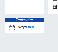
YAY!!!!! Back to Classic. Missing from the revised "Classic Mode" is the Community Box w/ the Storage Forum.0
-
 0
0 -
Not a fan of the new look. Even with the update it is still not font friendly. I wear readers and still have to look closely at the set fonts to make sure i'm clicking the right one. They need to be a little bigger and darker. The ID/DL box for the photos really needs fixed. Why did they shrink them so you have to click on it now to read any of them. It needs to fill in the tab box like it used to. MyHub is good for out in my facility to look up accounts and do move-out's however while in the office i much prefer to use the web edition. It needs the issues mentioned fixed and run a little faster with less auto flash refreshes that stop you from doing any task while they are running. I don't mind the over style it just needs to be bolder and more readable with The Photo box changed back to how it used to be.1
-
marketer_kristy Registered User, Daily Operations Certified, Advanced Operations Certified, myHub Certified ✭✭✭
Thank you for this.storable_support said:Thank you for the thoughtful feedback you’ve shared on the refreshed Sitelink experience. Our goal with these updates is to modernize the platform while continuing to support the way you run your business every day.
As we’ve listened to your input, one thing has been clear: flexibility matters. That’s why we’ve adjusted our approach.
Early access users can now choose between Sitelink Modern and Sitelink Classic using the toggle in the Tools menu. This gives your team the ability to work in the experience that fits you best today while helping us continue to shape and improve the modern experience for the future.
Based on your feedback, we’ve also optimized font sizes and visual scaling across the platform to enhance readability.
We’re grateful for your partnership and the feedback that helps us make Sitelink stronger.
Learn more about switching between Sitelink Classic and Sitelink Modern in our help article here.
Run a live update to get these updates today.
I did the update today, and switched back to what y'all are calling "Sitelink Classic." Upon doing so, I realized what has truly been my personal issue with the new look.
There needs to be color. The monochromatic, so-called "modern" look isn't functional, especially for neurodivergent people. I cannot stress this enough: functionality is so much more important than appearance. The colors and styles of the icons and the separation between them is so much better functionally than the monochromatic look. This look adds absolutely nothing to the user experience, it only takes away.
There are so many other things within the software that y'all could fix or improve, and it is so incredibly frustrating (as someone who's been with y'all almost 10 years) y'all put so much effort into pointless things like this being rolled out rather than those things being worked on. This new "modern" interface was a pointless use of y'all's time and money. We didn't ask for this.
Have y'all considered doing surveys to see what your customers actually want from y'all? I know we've met with people from Storable/SiteLink several times over the years at different conferences, and we remain frustrated despite reassurances that our frustrations with the Sitelink software were valid and that y'all would be working towards a solution for them.
I would personally respect y'all so much if you just did away with this update altogether, based on your customer's feedback.
I did find the new font/icon sizes in the "modern" version helpful, but not helpful enough to stay in that version. If you could consider adding a button for Corporate Control to toggle back to "classic" as well, that would be awesome.Kristy Olney Marketing and Bookkeeping Manager, Stor-All LLC2 -
Update to my last post. Even though they did make it darker the borders are still to uniform and not as noticable as the classic format. The DL/ID photo box is still showing the photos shrunk down and unreadable unlike the old format. That really needs updated so they fill in the entire box. It could still be darker for tenants and forms for the fonts. It improved a little bit but it still looks to uniform making navagation a bit harder to accomplish. Adding back the icons would help with this.2
-
Yes!! The Classic Look is BACK!!! 🙌 Switched it back first thing this morning—no hesitation! 😊
Huge shoutout to Storable Support for actually listening to your users. It really shows when feedback turns into action, and we appreciate that more than you know. At the end of the day, the people using the system daily know what works—and what doesn’t!
One thought to build on that momentum: not everyone can make it to the live Q&A sessions (we’re usually juggling customers and property operations). It might be worth offering a simple survey—maybe emailed out or linked directly in Sitelink Edition—so users can share feedback anytime. Making it easier to submit ideas, report issues, or suggest improvements could open the door for even more engagement and insight.2 -
Back on classic look, thank you sitelink for listening. How about working on the chip reader we have all been requesting.2
-
I'm glad to have the classic look back. There doesn't seem to be an option for going back to classic for Corporate Control though.
On a different note, I can't stand the login process ever since I changed to the single log in, especially on my phone. Every time I have to enter the corp code, location code, user name, and click the login button. Then it opens a new window where I have my username/email to fill in and then I have to hit the next button. After that I finally get to enter my password. That is way too many steps! Please fix this.2 -
Just ran another update. appears better.0


Categories
- All Categories
- 2 What's New
- SiteLink Community Discussions
- 2.1K SiteLink General Discussions
- 82 SiteLink myHub
- 50 Lead to Lease
- 16 Price Optimization
- 37 SiteLink Certified Professional
- 214 How-To's
- 97 Training Videos
- 7 Other Resources
- 108 SiteLink, SpareFoot & storEDGE merge
- Self-Storage Operations
- 66 Starting Out in Self-Storage
- 3 3rd Party Management
- 233 Regional Discussions
- 193 Miscellaneous Discussions
- 40 Industry Webinars
- SiteLink Marketplace
- 66 Self-Storage Website Design & Listing Services
- 34 Credit Cards & Payment Processing
- 32 Self-Storage Call Centers & Kiosks
- 46 Notifications, SMS & Phone Integrations
- 66 Self-Storage Insurance, Legal & Auctions
- 11 Self-Storage Revenue Management & Analytics
- 26 Gates & Access for Self-Storage Facilities
- 10 Ancillary Services for Self-Storage Facilites
- Self-Storage Times
- 59 News
- 30 Opinion
- 146 Lifestyle